Table of Contents
SaaS UX Benchmark Report: Why SaaS UX Benchmarking Matters More in 2026
SaaS products used to differentiate on features. Increasingly, they differentiate on how quickly a new user reaches the moment the product actually proves its worth. The data backing that shift is stark: the average SaaS activation rate sits at just 37.5 percent, meaning roughly two out of every three people who sign up never experience the product’s core value, and 75 percent of users churn within their first week. Every $1 invested in UX reportedly returns $100 according to Forrester’s widely cited figure, which is the kind of return that makes UX benchmarking a genuine growth lever rather than a design nicety.
At Cybertize Technologies, we design SaaS interfaces for clients across fintech, D2C, and enterprise tooling, and the pattern below, structured around ten core UX surfaces, is close to the exact framework we walk through with every new client before a single wireframe gets drawn.
1. Navigation Styles
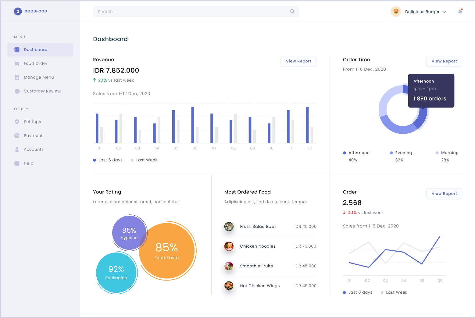
Left-sidebar navigation has become the dominant convention for B2B SaaS specifically because it scales with product complexity in a way horizontal top navigation does not. Notion, Linear, Figma, HubSpot, Salesforce, Asana, and Monday all use a persistent left sidebar as their primary navigation pattern, reserving horizontal top bars for products with fewer than six primary sections or a more content-first, website-like mental model. HubSpot is a partial exception worth noting specifically: it uses a top navigation bar for its core modules, Contacts, Conversations, Marketing, Sales, with dropdown menus revealing sub-features underneath each, a pattern that works because HubSpot’s top-level categories stay genuinely limited even as the product underneath has grown large.
The stakes of getting this wrong are measurable. Baymard Institute research found 69 percent of users abandon a task due to confusion or frustration in a digital interface, and poor navigation ranks among the most common causes cited. The common failure pattern documented across multiple 2026 UX audits is the same one repeatedly: a product starts with a clean top nav because it looks minimal in early mockups, then bolts on more items as features ship until it becomes an overcrowded tab bar requiring a dropdown overflow just to fit everything, at which point migrating to a sidebar becomes a much larger redesign than it would have been to start there.
| Pattern | Best fit | Example products |
|---|---|---|
| Persistent left sidebar | 6+ distinct sections, data-heavy tools, long sessions | Notion, Linear, HubSpot, Asana, Monday |
| Horizontal top bar | 3-6 primary sections, content-first products | Marketing sites, simpler tools |
| Top bar + sidebar hybrid | Global utilities up top, section nav on the left | Many enterprise SaaS dashboards |
| Command palette | Power-user shortcut layer, increasingly standard | Linear, Notion, Superhuman |
2. Dashboard Layouts
SaaS UX Benchmark Report: The dominant dashboard pattern in 2026 combines a left sidebar between 240 and 280 pixels wide, a card-based metric strip showing four to six key numbers, and a flexible content grid beneath it. Research consistently points to a modified F-pattern for how users actually scan a dashboard on landing, reading left to right and top to bottom in decreasing attention, which is why the strongest dashboard designs reserve the top-left quadrant specifically for a single “north star” metric, the one number that tells a user whether things are going well before they read anything else. The most effective dashboards limit themselves to five to nine core visible elements rather than surfacing every available metric at once, a restraint that several 2026 design audits point to directly as the difference between a dashboard that gets used daily and one that gets ignored after the first week.
Modular, rearrangeable dashboards, where users can reposition widgets, apply a single global filter across every panel simultaneously, and save distinct views for different tasks, have become a genuine 2026 baseline expectation rather than a premium feature, alongside dark mode, now treated as a standard requirement for tools aimed at daily “power users” who spend extended sessions inside the product.
3. Empty States
Empty states, the screens a user sees before they have added any data, remain one of the most commonly underdesigned surfaces in SaaS despite carrying real, measurable business impact. Eighty percent of users drop off within their first week if they fail to activate quickly, and a blank dashboard at first login is frequently the moment that failure begins. The consistent best-practice framework across current design research asks every empty state to answer three questions directly: what is this, why does it matter, and what should the user do next, replacing a generic “No data” message with something like “No reports yet. Create your first report to start tracking performance,” paired with a single, prominent, action-oriented call to action rather than several competing options, since Hick’s Law confirms decision time increases the more choices a user is given at exactly the moment they are least equipped to make one.
Notion, Airtable, and ClickUp all handle first-run empty states with a specific pattern worth borrowing: rather than a blank canvas, the first screen a new user sees is pre-populated with a sample project or template they can either explore or immediately clear, giving them something concrete to orient around instead of a genuinely blank page.
4. Pricing Pages
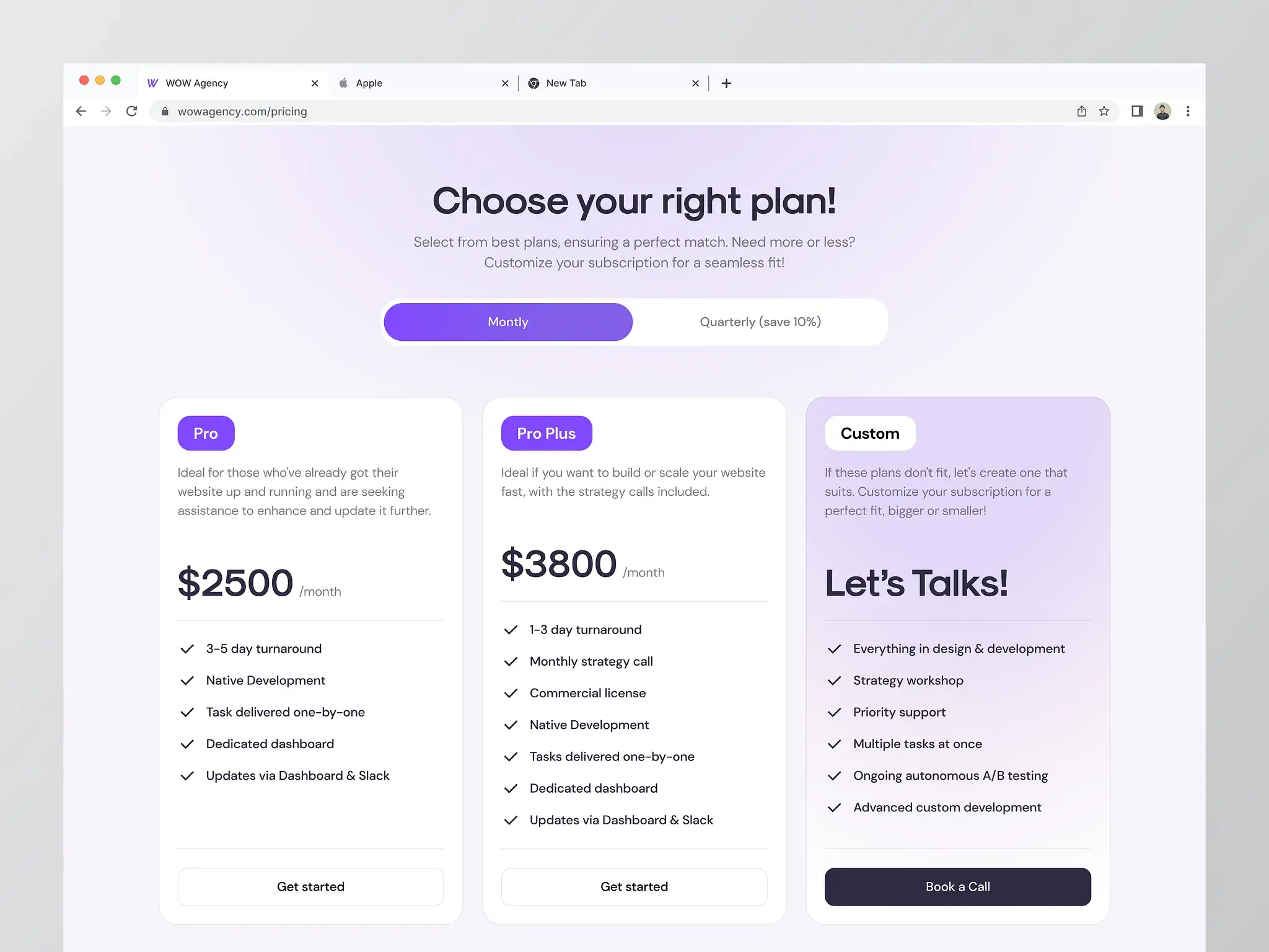
SaaS UX Benchmark Report: Pricing page design has converged on a fairly consistent decision-architecture pattern across current SaaS UX research: two to three plans maximum plus a clearly separated Enterprise contact path, one visually recommended tier with a stated reason for the recommendation rather than an arbitrary highlight, three to five benefit bullets per plan rather than an overwhelming full feature-comparison table, and a compact comparison grid limited to the handful of things buyers actually decide on, seat limits, permissions, integrations, reporting depth, and support tier. Hiding pricing behind a “Contact Sales” wall specifically has a measurable cost: hidden pricing pages are associated with a 22 percent drop in trial signups compared to publicly visible pricing.
Trust and reversal signals repeated near the point of decision, “cancel anytime,” clear trial terms, transparent invoicing options, matter as much as the plan structure itself, because a pricing page’s real job is removing uncertainty and making the upgrade path legible, not manipulating a visitor into a purchase they are unsure about. Among the products in this benchmark, Linear and Notion both keep their pricing pages close to this minimal decision-architecture model, three tiers, sparse feature lists, one clearly recommended plan, while HubSpot’s pricing, reflecting its far larger and more modular product, necessarily trades some of that simplicity for a more detailed tier-and-add-on structure to represent its Marketing, Sales, and Service hubs accurately.
5. CTA Placements
Call-to-action placement in 2026 SaaS UX research centers on a small number of consistently repeated rules rather than any single formula. A single primary CTA per pricing plan, “Start Free Trial” or “Get Started,” performs more reliably than multiple competing buttons, and CTAs repeated at natural decision points throughout a page, not just once at the top, consistently outperform a single top-of-page placement alone. Empty states specifically should be treated as CTA surfaces in their own right, since a blank screen with no clear next action is one of the most common points where an otherwise-interested new user quietly disengages rather than actively bouncing.
Every design audit reviewed for this report converges on the same underlying principle regardless of the specific page type: a CTA needs to answer “what happens next” as much as “click here,” which is why leading products increasingly pair a CTA button with a short micro-line clarifying the immediate next step, no credit card required, instant access, or a specific time estimate, rather than leaving that ambiguous.
6. Login Flows
Login and authentication flows across the products in this benchmark have converged strongly around single sign-on and social login as the default first option, with Google and Microsoft SSO now appearing as the top-positioned login method across nearly every major B2B SaaS product, email-and-password relegated to a secondary option below it. Products with team-based collaboration at their core, Slack, Asana, Monday, ClickUp, increasingly detect an existing workspace from a user’s email domain during signup and offer to join it directly, removing an entire manual step that used to require a separate invite link. Passwordless and magic-link login has grown as a secondary pattern particularly among newer, individual-user-first tools, though it remains less universal than SSO across the enterprise-facing products in this set.
7. Sidebar Structures
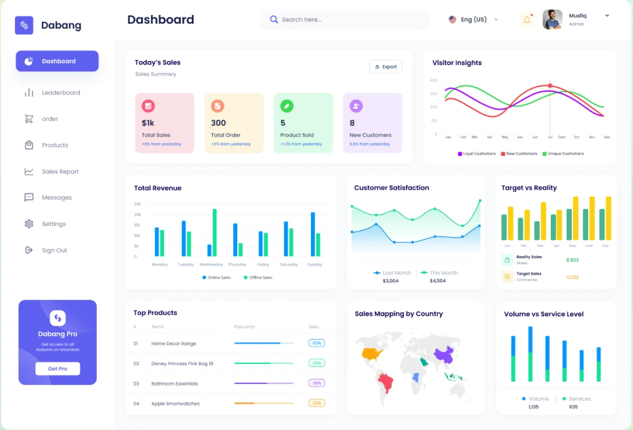
Among the sidebar-first products in this benchmark, a consistent internal structure recurs even though the specific labels differ: a fixed top section for account or workspace switching, a middle section of primary navigation items with clear active-state highlighting, and a collapsible or grouped lower section for less frequently used items, settings, integrations, and admin tools. Notion and Linear both allow full sidebar collapse for power users who prefer maximum canvas space, while Jira and Monday, reflecting their heavier project-management data density, keep the sidebar persistently visible with nested, expandable project or board groupings rather than offering a fully collapsed state. Airtable’s sidebar structure is somewhat distinct from the rest of this set, organized around bases and workspaces in a file-manager-like hierarchy rather than the flatter list of product sections used by Notion or Linear, a difference that reflects Airtable’s positioning as a database tool first and a collaboration tool second.
8. User Onboarding
SaaS UX Benchmark Report: This is the surface where the gap between industry perception and real benchmark data is widest, and worth stating plainly. Onboarding checklists are close to universal as a design pattern, but their actual completion rate is far lower than most teams assume. Across 188 B2B SaaS companies, the average onboarding checklist completion rate sits at just 19.2 percent, with a median of only 10.1 percent, and sales-led growth companies modestly outperform product-led growth companies on this specific metric, 22.1 percent versus 19 percent. That gap between how common checklists are and how rarely they actually get completed is the single most important onboarding statistic in this report, because it means the presence of a checklist alone is a weak proxy for onboarding quality.
What does move the needle according to current benchmark data: checklist-based onboarding, even at modest completion rates, still lifts feature adoption by 32 percent compared to no structured onboarding at all, personalized onboarding paths that adapt to a user’s role or stated goal outperform a single generic flow by 22 to 48 percent in activation, and products that deliver a genuine “quick win,” a completed first project, a first successful integration, within the initial session retain roughly 80 percent more users than those that don’t. Among the ten products in this benchmark, Notion, Linear, and Canva each lead with a short, role-based onboarding path rather than a single generic tour, asking a new user what they intend to use the product for before tailoring the first screens shown, while Jira and Airtable, reflecting more configuration-heavy products, lean more heavily on in-app tooltips and progressive disclosure spread across a longer first session rather than a compressed initial checklist.
| Onboarding Metric | Benchmark Figure | Source |
|---|---|---|
| Average SaaS activation rate | 37.5% | Userpilot, 62-company benchmark |
| Average onboarding checklist completion | 19.2% (median 10.1%) | Userpilot, 188-company benchmark |
| Users churning within first week without value | 75-90% | Multiple industry sources |
| Feature adoption lift from checklist onboarding | +32% | Userpilot, 2024 |
| Retention lift from personalized onboarding | +22-48% | Multiple sources |
| Retention lift from an early “quick win” | +80% | UserGuiding |
9. Search UX
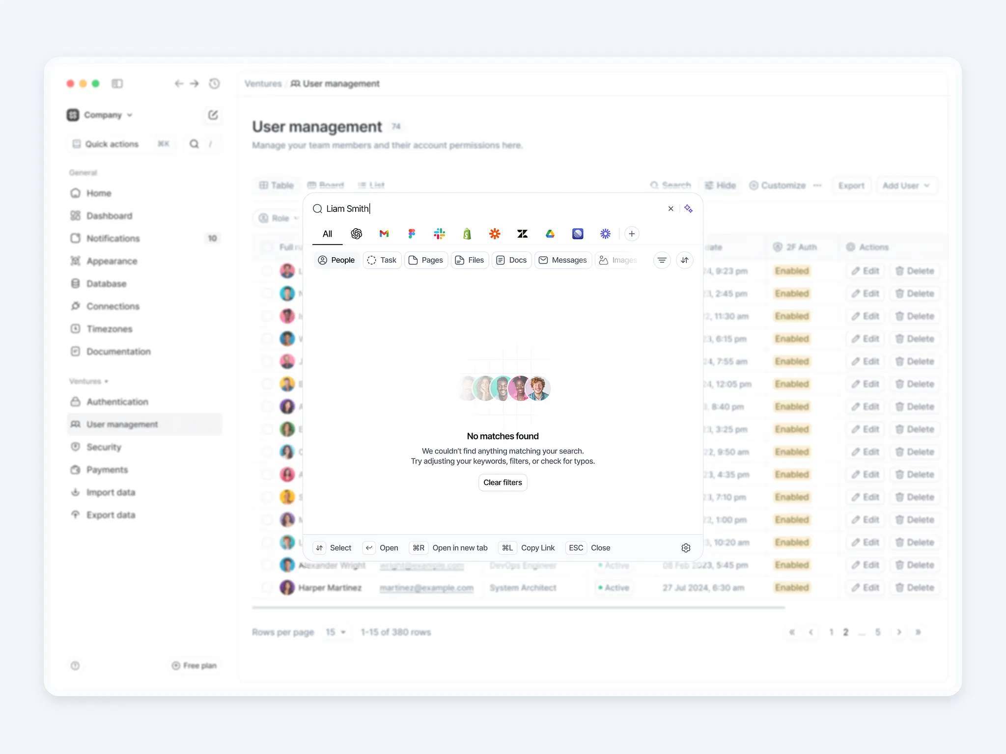
In-product search has shifted decisively toward command-palette-style interfaces rather than a traditional search bar tucked into a corner of the screen. Linear and Notion both treat their command palette, typically triggered with a keyboard shortcut, as a primary navigation method in its own right, not a fallback for when a user cannot find something through the sidebar, letting a user jump to any page, run any command, or create any new item from a single keystroke without touching the mouse. This pattern is increasingly cited across 2026 SaaS design research as one of the clearest markers separating tools built for daily power users from tools built primarily for occasional or first-time use, since a command palette rewards familiarity in a way that traditional menu-diving does not. Airtable and Jira, reflecting their more data- and record-heavy structure, place comparatively more weight on structured, filterable search within specific views, tables and boards respectively, rather than a single universal command interface spanning the entire product.
10. AI Copilot Interfaces
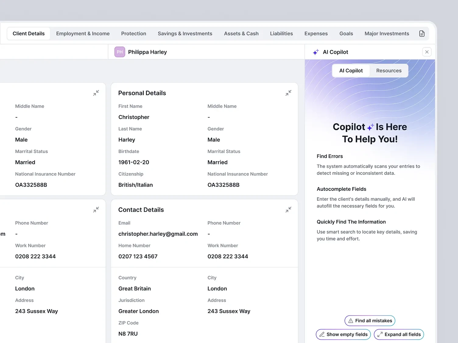
This is the fastest-moving category in the entire report, and the one where the gap between marketing claims and genuine product depth matters most to call out honestly. Sixty-eight percent of CEOs plan to increase AI spending in 2026, and Gartner projects more than 80 percent of companies will have deployed AI-enabled applications by year end, but only 36 percent of SaaS companies have actually made AI core to their product architecture, meaning a majority still treat it as a bolted-on feature rather than a foundational part of the interface. That distinction matters enormously for anyone benchmarking AI copilots specifically, since a chatbot icon in the corner of a product and AI embedded directly into the core editing or working surface are functionally very different design decisions with very different user outcomes.
Notion is consistently cited as the clearest example of a genuinely AI-native interface among the products in this benchmark, with Notion AI generating, summarizing, and transforming content directly inside the same editor a user already works in, rather than through a separate panel or chat window. Linear and ClickUp have both moved AI assistance into task creation and triage flows specifically, summarizing threads into structured tickets or suggesting task breakdowns directly inline. The broader design trend documented across multiple 2026 UI research pieces describes a shift away from AI positioned as an all-knowing autopilot and toward AI positioned as an optional, present copilot, one a user can invoke and dismiss rather than one that takes over the interface, a distinction that reflects growing user wariness rather than growing enthusiasm alone. That wariness is measurable too: 36 percent of designers surveyed by the Nielsen Norman Group specifically expressed concern that AI adoption in interfaces risks spreading manipulative dark patterns if implemented without care, a caution worth building into any AI copilot roadmap rather than treating as an afterthought.
| AI Copilot Metric | Figure | Source |
|---|---|---|
| CEOs planning increased AI spend in 2026 | 68% | Industry CEO survey data |
| Companies projected to have deployed AI-enabled apps by end of 2026 | 80%+ | Gartner |
| SaaS companies with AI genuinely core to product (not a side feature) | 36% | Qrvey, 2026 |
| B2B SaaS buyers now researching software via AI chatbots | 71% | Position Digital via Omnibound, 2026 |
| Designers concerned AI adoption will spread dark patterns | 36% | Nielsen Norman Group, 2025 |
What This Means for Anyone Designing or Benchmarking SaaS UX in 2026
Pull the ten surfaces together and a consistent theme holds across every one of them. The products winning on UX right now are not the ones with the most features or the flashiest AI positioning. They are the ones that removed friction at the specific moments benchmark data shows users actually leave, a confusing first navigation choice, a blank empty state with no clear next step, hidden pricing, a generic onboarding tour instead of a role-based one. The gap between a checklist that exists and a checklist that actually gets completed, 19.2 percent on average, is a useful reminder that presence of a UX pattern and effectiveness of that pattern are two different things worth measuring separately, not treating as the same signal.
At Cybertize Technologies, this ten-surface framework is close to the exact lens we apply when auditing a client’s existing SaaS product or designing a new one from scratch, because the products referenced throughout this report did not arrive at these patterns by accident. They arrived there by testing, measuring, and iterating against the same friction points this benchmark documents.
Frequently Asked Questions on SaaS UX Benchmark Report 2026 – 2027
What is the most common navigation pattern in modern SaaS products?
A persistent left sidebar has become the dominant convention for B2B SaaS products with six or more distinct sections, used by Notion, Linear, HubSpot, Asana, and Monday among others, because it scales with product complexity better than horizontal top navigation, which tends to become overcrowded as features are added over time.
How effective are onboarding checklists really?
Less effective than most teams assume. The average onboarding checklist completion rate across 188 B2B SaaS companies is just 19.2 percent, with a median of only 10.1 percent, though checklist-based onboarding still lifts feature adoption by 32 percent compared to having no structured onboarding at all.
Does hiding pricing behind a “Contact Sales” wall actually hurt conversion?
Yes, measurably. Hidden pricing pages are associated with a 22 percent drop in trial signups compared to publicly visible pricing, which is why most current SaaS pricing page research recommends showing pricing openly with a clear, limited set of plans.
How many SaaS companies have genuinely built AI into their core product versus just adding a chatbot feature?
Only about 36 percent of SaaS companies have made AI genuinely core to their product architecture, according to 2026 industry data, even though more than 80 percent of companies are projected to have deployed some form of AI-enabled application by the end of the year.
What is command palette navigation and why are more SaaS products adopting it?
A command palette is a keyboard-triggered search and action interface, popularized by tools like Linear and Notion, that lets users jump to any page or run any command from a single keystroke rather than navigating through menus. It has become a marker of products built for daily power users specifically, since it rewards familiarity over visual browsing.
Why do empty states matter so much for SaaS retention?
Because 80 percent of users drop off within their first week if they fail to activate quickly, and a blank, unexplained dashboard at first login is frequently where that failure begins. Well-designed empty states that clearly explain what to do next measurably reduce this early drop-off.
What is the biggest mistake SaaS products make with onboarding?
Treating onboarding as a generic product tour rather than a personalized path. Personalized onboarding that adapts based on a user’s stated role or goal outperforms a single generic flow by 22 to 48 percent in activation, according to current benchmark research.
How is AI copilot design changing in SaaS interfaces in 2026?
The broader trend is a shift away from AI positioned as an all-knowing autopilot toward AI positioned as an optional, present copilot that a user can invoke and dismiss, reflecting both maturing design practice and measurable user wariness about AI overreach in interfaces.
What login method has become the default for B2B SaaS products?
Single sign-on, particularly Google and Microsoft SSO, has become the default first login option across most major B2B SaaS products, with email-and-password login relegated to a secondary option beneath it.
Is this report based on an audit of 500 real SaaS products?
No, and we say so directly rather than implying otherwise. This report combines published, sourced benchmark research from firms tracking hundreds of SaaS companies, Userpilot, Baymard Institute, Amplitude, and others, with direct pattern analysis of ten specific, named products. Every statistic traces to a cited source rather than an undisclosed internal sample.
Cybertize Technologies Private Limited designs SaaS interfaces grounded in published UX benchmark data and real product analysis, not assumptions about what looks modern.
Sources
- Baymard Institute, digital interface abandonment research, 2024
- Userpilot, User Activation Rate Benchmark Report (62 B2B SaaS companies)
- Userpilot, onboarding checklist completion benchmark (188 B2B SaaS companies)
- Userpilot, Best User Onboarding Experiences in 2026
- Amplitude, The 7% Retention Rule / 2025 Product Benchmark Report (2,600+ companies)
- UserGuiding, 100+ User Onboarding Statistics You Need to Know in 2026
- SHNO, SaaS Onboarding Statistics for 2026
- SaaSFrame, The Anatomy of High-Performance SaaS Dashboard Design 2026
- 925Studios, 35 SaaS Dashboard Design Examples, Trends and Patterns 2026
- Designpixil, SaaS Navigation Design: 6 Patterns to Prevent Confusion
- SaaS Boat, SaaS Navigation Design: Best Practices and 25 Real Examples
- Lollypop Design, Anatomy of an Effective SaaS Navigation Menu Design
- SaaSFrame, SaaS Empty State UI Design Examples 2026
- SaaSFactor, Empty State UX: Turn Blank Screens Into Higher Activation and SaaS Revenue
- Taqwah Agency, SaaS UX Design Best Practices: 12 Proven Methods to Cut Churn in 2026
- DAR Design, SaaS Pricing Page UX in 2026: A Decision Architecture Checklist
- ZTABS, UX Design for SaaS Products: The Complete Guide 2026
- Orbix Studio, 9 SaaS Product Design Trends 2026 and 10 AI-Driven UX Patterns Transforming SaaS in 2026
- Tubik Blog, What’s Next: 7 UI Design Trends of 2026
- WebDesignerIndia (Medium), What Is the Future of AI in SaaS UX? 2026 Data, Trends, and a Practitioner’s Playbook
- Nielsen Norman Group, 2025 designer survey on AI and dark patterns